Use purple to yellow gradient EVERYWHERE!Shin-AMV wrote:I really should have seen it coming D:JudgeHolden wrote:Poor Shin, he must have known he was walking into a trap.
>.>
But anyways, to those that contributed, thanks. I'm not looking for any specific thing just general tips on aesthetics. So tips regarding on how much saturation is too much saturation, or a warning on how purple to yellow gradient overlays don't generally mesh well in maintaining most atmospheres or moods, or generally things of that nature is what I was hoping to dig up.
Shop Talk: Pretty Shiny Colors
-
Nya-chan Production

- The :< point of view
- Joined: Wed Nov 15, 2006 11:21 am
- Status: White bracelet
- Location: Ward 7F
- Contact:
Re: Shop Talk: Pretty Shiny Colors

-
zibbazabba905

- Joined: Fri Aug 27, 2010 5:18 pm
Re: Shop Talk: Pretty Shiny Colors
actually it should be teal and orange but whatever...
I've been trying to figure out what they did to make the wizard of oz look like it does with the colors... It was one of the earliest (or biggest i dunnknow) technicolor films, but I've tried a few pre-made filters, and I've tried recreating the 2 strip/3 strip concept, but I just can't get it to look right
I've been trying to figure out what they did to make the wizard of oz look like it does with the colors... It was one of the earliest (or biggest i dunnknow) technicolor films, but I've tried a few pre-made filters, and I've tried recreating the 2 strip/3 strip concept, but I just can't get it to look right
"Uhmmm... You know... it was at that point that I realized that maybe Thierry wasn't actually a film maker, and he was maybe just someone with mental problems who happened to have a camera. " -Banksy
-
shati
- Joined: Sun May 02, 2004 4:53 pm
- Location: USA
Re: Shop Talk: Pretty Shiny Colors
When color correcting, keep an eye on skin tone. Most people don't have a particularly strong sense of what shade of green a hand-drawn tree should be, but if skin looks too orange, too red, too blue, too green, etc., we'll recognize that something is off. This isn't necessarily a problem if the entire frame is tinted blue, since we're all used to adjusting for lighting, but when you crank up saturation (for example), you're usually bringing what was a dull shade of brown to a much less human looking shade of (whatever is the dominant hue). If you really need to drastically raise the saturation for shitty quality footage, sometimes the easiest way to make it not look like you did is to take a quick look the most prominent character's skin, see what unholy color is blazing out of it, and use a correction tool that lets you push that hue (and only that hue) toward its opposite. You can also try selectively lowering saturation on just that hue, but that's letting the saturation tool win.
If you're masking two shots, pick something that should be consistent between them (I'm going to sound creepy if I say skin again) and check whether it's actually the same hue. Or if you feel confident that you will notice the difference, just adjust it by instinct, but I see a lot of masks where one shot is very visibly separated from the other by hue (or different contrast level) and it's distracting. Especially if both shots have something that is supposed to be white, comparing can tell you a lot.
I just have a lot of feelings about color correction. Of course, shitty monitors throw everything into question.
If you're masking two shots, pick something that should be consistent between them (I'm going to sound creepy if I say skin again) and check whether it's actually the same hue. Or if you feel confident that you will notice the difference, just adjust it by instinct, but I see a lot of masks where one shot is very visibly separated from the other by hue (or different contrast level) and it's distracting. Especially if both shots have something that is supposed to be white, comparing can tell you a lot.
I just have a lot of feelings about color correction.
-
zibbazabba905
- Joined: Fri Aug 27, 2010 5:18 pm
Re: Shop Talk: Pretty Shiny Colors
Sorry if this is a trivial thing or what not but you just blew my mind. http://i42.tinypic.com/xng3sw.jpgshati wrote:When color correcting, keep an eye on skin tone. Most people don't have a particularly strong sense of what shade of green a hand-drawn tree should be, but if skin looks too orange, too red, too blue, too green, etc., we'll recognize that something is off.
"Uhmmm... You know... it was at that point that I realized that maybe Thierry wasn't actually a film maker, and he was maybe just someone with mental problems who happened to have a camera. " -Banksy
-
Taite

- Joined: Fri Jun 26, 2009 12:33 am
- Location: Colorado
Re: Shop Talk: Pretty Shiny Colors
I hate gradients and discourage anyone I possibly can from using them. This is a person preference of mine, but when I see gradients on amvs, I'm automatically turned off  I know there have been a few good cases for this, but I can't remember any of them off the top of my head.
If you're creative enough, gradients can be used well. I discourage adding the same gradient over an entire amv and calling it color correcting though, because it's so obvious it's painful. And you're very limited with a flat gradient.
I use Color Curves in Vegas for everything (not Color Corrector) but I know you can also buy/download things that are specifically made for that as well. Personally, I don't see the point. Every color correction that I've ever wanted to make I can easily do with Black and White and Color Curves in Vegas (b&w not always necessary either.)
shati makes an amazing point that I think people literally forget when color correcting. Skin tone is the most important thing to pay attention to. Always try to preserve the fleshy tones of skin. Even if you're using a blue color for correcting, you can get away with having a very light blue tone to the skin, and really, you can experiment with this and create different moods, there's no right and wrong. You can achieve a "dreamy" affect with some glow and blue, etc. It's all open for interpretation. But cranking up the saturation, using gradients, or adding a very saturated color at all, I advise being careful because it erases the fleshy tones and then it's so obviously color corrected, but in a bad way. Obviously there's exceptions to this-- it all depends on what effect you want. But this is just something to take special note of.
Color Corrector is not the right way to go if you want a very rich and natural color correction, imo. I never use it, I think it looks shitty and flat. Adding levels seems like an easy fix, to get rid of the dusty, dry effect, sure. But you're limiting yourself using color corrector. Depends on the effect you want, maybe you want something verrrrrry subtle, but man, you're crazy limited. I don't even bother, even if I want something incredibly subtle. You can achieve the same thing with color curves, but you'll have more depth and control.
Here is an example. Top img: original. Second: Very basic color curves. Third: Adding Black and White before the color curves. I wanted a flat brown/sepia color, so I made this with the black and white on there.

**so even though there are sepia presets on vegas, I create my own in Color curves. You have sooo much more control.**
Example 2: Top is original. Everything below are just different color curves I saved. All but the bottom one are just 1 color curves. The bottom is 2, with a 75% b&w. Mixing in b&w is a great way to discover different colors as well.

Example 3: When masking and overlaying scenes that take place during different times of the day, color curves is useful as well. If you don't have color curves on the rest of the video, I can see color corrector being used here, or just smart scene selection and not having to use much. For my recent video, I did have color curves on other scenes, and so using it on the masked scene made it look more natural. If I were to just have color curves on that one scene, it would look odd compared to the others.
Here I masked two scenes, one taking place at sunset, the other at dawn. So one had bluish tints, the other orange. They look alright together, but not completely blended (top scene.) However, I had to make this masked scene fit with the previous scenes, which take place at night. So, I then added a multitude of color curves to each. (second.) Then, I placed the background on a layer that had color curves applied to that entire layer, which gave it a reddy warm tint. The top layer remained unaffected. (third.) Lastly, I rendered all of that, and placed the flattened clip on the layer with the curves that applied to the entire video. (as well as soft contrast for the blurred border, four.) You can see how this blends with the previous scenes before it in Please Don't Go.

I've also used Color Curves to make night images look like day, and vice versa. (Not like the above-- I mean, dark clips, to daylight scenes.)
There's a plethora of different combinations. For that last slide, I used about 5 different color curves on each clip, plus some levels and black and white, and so on. It depends on the effect you want to create. All of my needs are met by using those few effects, and it's so much fun making different colors as well. I've about 30 different curves saved, which I can mix, use alone, adjust how I want. It's really quite simple, and it's frankly the most fun I have making an amv Even though when you look at mine, I really don't use them that often. However, even if I'm not doing intense color correcting, I always use color curves on my videos to add more depth and vibrancy. I never saturate anything, just add color curves.
****As far as how you get to creating the colors: open up color curves, add the Warm Colors preset to a clip, and you get the blue, green, and red line. Take the squares that you see and drag them up, down, left, right, whatever, and just see what it does. Each of these can be bended and stretched for different results, and each line controls certain colors in the image. There's an unlimited amount of combinations-- you have complete control. And it's really quite easy. You can add different presets and play around with the lines on them as well to get whatever effect you want. When all the lines are in a straight diagonal line, that's when you have the original image colors. Then just move the lines, save what you made, and blah blah so on.
By adding the Reset to None preset, you control the blacks and whites and brightness and such, which is a better alternative to using Levels imo.
^^^^You may already know how it works, but that's just a basic how-to, just in case.
And I don't claim that my method is the best. I'm just sharing how I do things. You can use a gradient if you like, or color correction. It depends on what you're trying to create.
But really, gradients cause me great pain to see. So ugly.
If you're creative enough, gradients can be used well. I discourage adding the same gradient over an entire amv and calling it color correcting though, because it's so obvious it's painful. And you're very limited with a flat gradient.
I use Color Curves in Vegas for everything (not Color Corrector) but I know you can also buy/download things that are specifically made for that as well. Personally, I don't see the point. Every color correction that I've ever wanted to make I can easily do with Black and White and Color Curves in Vegas (b&w not always necessary either.)
shati makes an amazing point that I think people literally forget when color correcting. Skin tone is the most important thing to pay attention to. Always try to preserve the fleshy tones of skin. Even if you're using a blue color for correcting, you can get away with having a very light blue tone to the skin, and really, you can experiment with this and create different moods, there's no right and wrong. You can achieve a "dreamy" affect with some glow and blue, etc. It's all open for interpretation. But cranking up the saturation, using gradients, or adding a very saturated color at all, I advise being careful because it erases the fleshy tones and then it's so obviously color corrected, but in a bad way. Obviously there's exceptions to this-- it all depends on what effect you want. But this is just something to take special note of.
Color Corrector is not the right way to go if you want a very rich and natural color correction, imo. I never use it, I think it looks shitty and flat.
Here is an example. Top img: original. Second: Very basic color curves. Third: Adding Black and White before the color curves. I wanted a flat brown/sepia color, so I made this with the black and white on there.

**so even though there are sepia presets on vegas, I create my own in Color curves. You have sooo much more control.**
Example 2: Top is original. Everything below are just different color curves I saved. All but the bottom one are just 1 color curves. The bottom is 2, with a 75% b&w. Mixing in b&w is a great way to discover different colors as well.

Example 3: When masking and overlaying scenes that take place during different times of the day, color curves is useful as well. If you don't have color curves on the rest of the video, I can see color corrector being used here, or just smart scene selection and not having to use much. For my recent video, I did have color curves on other scenes, and so using it on the masked scene made it look more natural. If I were to just have color curves on that one scene, it would look odd compared to the others.
Here I masked two scenes, one taking place at sunset, the other at dawn. So one had bluish tints, the other orange. They look alright together, but not completely blended (top scene.) However, I had to make this masked scene fit with the previous scenes, which take place at night. So, I then added a multitude of color curves to each. (second.) Then, I placed the background on a layer that had color curves applied to that entire layer, which gave it a reddy warm tint. The top layer remained unaffected. (third.) Lastly, I rendered all of that, and placed the flattened clip on the layer with the curves that applied to the entire video. (as well as soft contrast for the blurred border, four.) You can see how this blends with the previous scenes before it in Please Don't Go.

I've also used Color Curves to make night images look like day, and vice versa. (Not like the above-- I mean, dark clips, to daylight scenes.)
There's a plethora of different combinations. For that last slide, I used about 5 different color curves on each clip, plus some levels and black and white, and so on. It depends on the effect you want to create. All of my needs are met by using those few effects, and it's so much fun making different colors as well. I've about 30 different curves saved, which I can mix, use alone, adjust how I want. It's really quite simple, and it's frankly the most fun I have making an amv
****As far as how you get to creating the colors: open up color curves, add the Warm Colors preset to a clip, and you get the blue, green, and red line. Take the squares that you see and drag them up, down, left, right, whatever, and just see what it does. Each of these can be bended and stretched for different results, and each line controls certain colors in the image. There's an unlimited amount of combinations-- you have complete control. And it's really quite easy. You can add different presets and play around with the lines on them as well to get whatever effect you want. When all the lines are in a straight diagonal line, that's when you have the original image colors. Then just move the lines, save what you made, and blah blah so on.
By adding the Reset to None preset, you control the blacks and whites and brightness and such, which is a better alternative to using Levels imo.
^^^^You may already know how it works, but that's just a basic how-to, just in case.
And I don't claim that my method is the best. I'm just sharing how I do things. You can use a gradient if you like, or color correction. It depends on what you're trying to create.
But really, gradients cause me great pain to see. So ugly.


-
ZephyrStar

- Master of Science
- Joined: Fri Sep 17, 2004 3:04 am
- Status: 3D
- Location: The Laboratory
- Contact:
Re: Shop Talk: Pretty Shiny Colors
This this this.Taite wrote:shati makes an amazing point that I think people literally forget when color correcting. Skin tone is the most important thing to pay attention to. Always try to preserve the fleshy tones of skin. Even if you're using a blue color for correcting, you can get away with having a very light blue tone to the skin, and really, you can experiment with this and create different moods, there's no right and wrong. You can achieve a "dreamy" affect with some glow and blue, etc. It's all open for interpretation. But cranking up the saturation, using gradients, or adding a very saturated color at all, I advise being careful because it erases the fleshy tones and then it's so obviously color corrected, but in a bad way. Obviously there's exceptions to this-- it all depends on what effect you want. But this is just something to take special note of.
Color correction can work wonders for the mood in a video. As far as the technical aspect of doing this, you want to use something that lets you have control over highlights, mids, and lows, and the RGB for each of those. I forget the name of the one in AE (though I use it all the time >____>) I only use the hue/sat adjustment to desaturate so I can go back in and make adjustments over top of that.
As far as what the colors MEAN, check out color theory and color psychology. Really cool for helping to subliminally influence your audience. Everyone likes to throw grunge on things, desaturate things, and just go nuts with it... "oh hey, instant horror video!" But...
-warm colors, that can literally convey the psychological feeling of warmth, are yellows, oranges, reds
-cool colors, blues, purples, etc, are the opposite
-consider that bright almost unnatural greens and yellows are sickly...poisinous, noxious (just look at poison dart frogs)
-reds and oranges can induce appetite (next time you're at a restaurant, pay attention to the menu layout & colors)
-medium blues make you sleepy (well, at least in theory) and have a calming effect
-the same is true for a medium pink surprisingly
-purple is unsettling as it is not found in nature very often, it is the color of royalty, of rarity (also not surprisingly used as a color for supernatural forces in anime)
You can also work with colors that clash to make your audience feel uneasy. This is the only time I'd recommend using gradients, because you can really wreck a piece of footage
Check out Josef Albers, he was an artist that worked in this kinda stuff. (just google image search his name, notice how some of the images might be unsettling, and some seem to shift as you look at them, or even can make some people sick)
So....for example, alternating shots back and forth that are graded with two of these clashing colors will make your audience very uneasy. And it can be subtle, that's what's great about color grading and color psychology. It's like a secret weapon for influencing emotion.
/artprof
-
Shin-AMV

- Joined: Mon Mar 15, 2010 10:15 pm
- Status: Ching Chong Dumpling Princess
Re: Shop Talk: Pretty Shiny Colors
Sweet. Some of this stuff is really useful. Especially the stuff regarding skin tones and matching blacks.
I've been playing around with the color curves tool a lot but I might end up picking your brain some more about that Taite.
I've been playing around with the color curves tool a lot but I might end up picking your brain some more about that Taite.

-
xDreww

- Joined: Thu Jan 07, 2010 9:45 pm
Re: Shop Talk: Pretty Shiny Colors
What Tatie said.
I would give a big explanation on my color correction, scene a lot of people like it, but I don't feel like reading or writing something big right now. Me being lazy again. but Taite pretty much explained some good stuff. I'll just show you one snapshot I did.
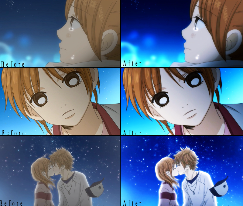
I basically just use overlay,add on this. Blur for the bottom layer..blue tone..brightness and contrast..color curves always..Same thing with my other edits..color curves..yellow tint..black and white added on sometimes. Just mess around with it I guess.
I would give a big explanation on my color correction, scene a lot of people like it, but I don't feel like reading or writing something big right now. Me being lazy again. but Taite pretty much explained some good stuff. I'll just show you one snapshot I did.
I basically just use overlay,add on this. Blur for the bottom layer..blue tone..brightness and contrast..color curves always..Same thing with my other edits..color curves..yellow tint..black and white added on sometimes. Just mess around with it I guess.

-
zibbazabba905
- Joined: Fri Aug 27, 2010 5:18 pm
Re: Shop Talk: Pretty Shiny Colors
can we see what your color curves window looks like, and aside from the skin tone concept, do you use some type of formula for it, or just do it by eye? (by "you" i mean plural)
and is there a big difference between using "color curves" vs "color corrector"?
and is there a big difference between using "color curves" vs "color corrector"?
"Uhmmm... You know... it was at that point that I realized that maybe Thierry wasn't actually a film maker, and he was maybe just someone with mental problems who happened to have a camera. " -Banksy
-
Taite
- Joined: Fri Jun 26, 2009 12:33 am
- Location: Colorado
Re: Shop Talk: Pretty Shiny Colors
Feel free Shin (:
@Drew Tatie?! LOL
Anyhow, Drew gives a good example of how Color Curves can be used to "brighten" up an image without cranking up the saturation, and also just giving it a bit more depth and richness to it. (*coughyou'rewelcomeforshowingyoucolorcurvesdrew*)

**Here is an image of all of the color curves applied to one clip, there is the final result, and above is just a few of the presets I use, out of about 30 I've created.
This is an example of what a bunch of color curves can do, even though the result is simple. It's not complicated because there's more, but for me, I tend to have more than one, just because it's so darn fun combining them and seeing what they look like.
( If anyone would like, I can go through and post screencaps of what the color curves looks like (ie, the squiggly lines in the window) and what it looks like on an image., also, feel free to skype me if you're more interested in it. )
Also, I'm not an expert, but Color Correction deals with the mids, lows, and highs. High being the lightest colors (typically the skin tone then, which makes this virtually useless), lows are obviously, then, for the darkest colors, and mids, the stuff in between. Just put a clip in vegas, add the "Color Correction" Reset to None preset, and just mess with one at a time and you can see what it does. It always gives a dusty appearance using Color Correction because, as you can see when you use it in vegas, the selector only allows you to choose ONE color for the mids/lows/highs. So you have 3 colors you can have in your image. You can layer like I did too, but then you only get 6, and 9, and 12, and so on...
Color Curves, on the other hands, deals with the reds, blues, and greens of an image. Now, I can't give it an easy explanation that I can for Color Correction, but this method of RGB manipulates the image on a more personal level, since obviously the amount and place of RGB differs on every scene, just as it does in real life, and therefore giving it a more 'natural' appearance, if you will. You don't just pick one color for the R,G, and B, because how you change the R directly affects the appearance of the B when you use it.